
Anchor Inn Motel
Brand Identity
Worth pulling over for.
the setup
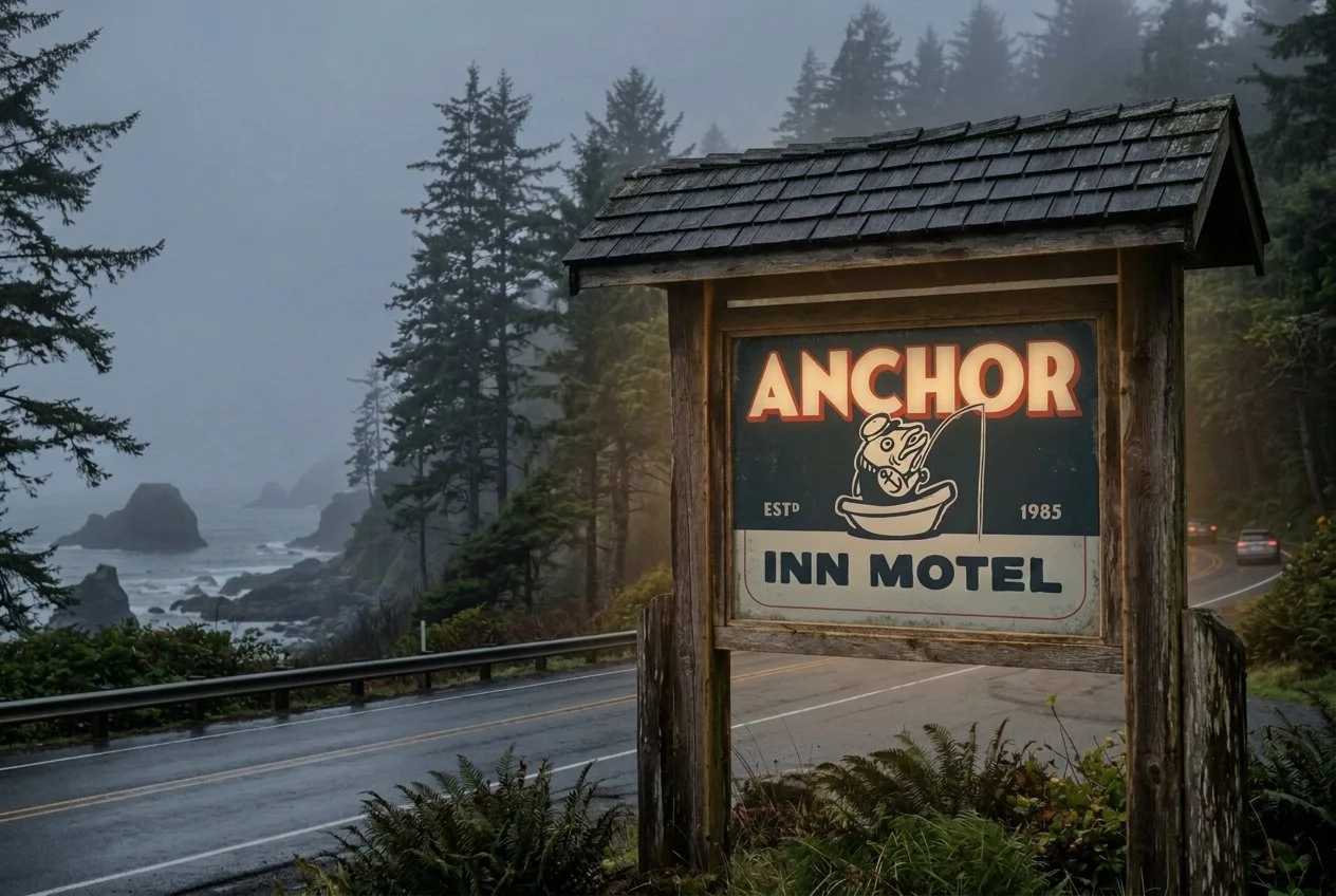
Nestled in the heart of the moody Pacific Northwest lies the Anchor Inn Motel, a bed and breakfast warmed by an authentic rustic charm. The Anchor Inn has a problem its rooms don't deserve. While the inside features warm wood, pristine bedding, and kitchenettes that make you want to stay the week, outside stands an unassuming sign that promises none of it. This rebrand closes the gap via an identity with enough visible care that a passerby stops and looks twice.
Brief
Conceptual rebrand for a working motel; student project, unsolicited. The founding date is a placeholder as no public record exists.
Deliverables
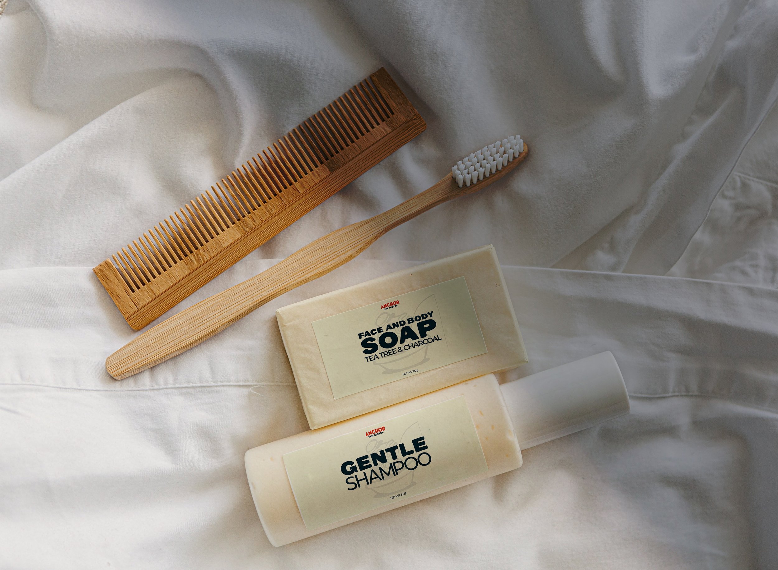
Logo system, visual identity, signage, amenities packaging, door collateral.
the marks
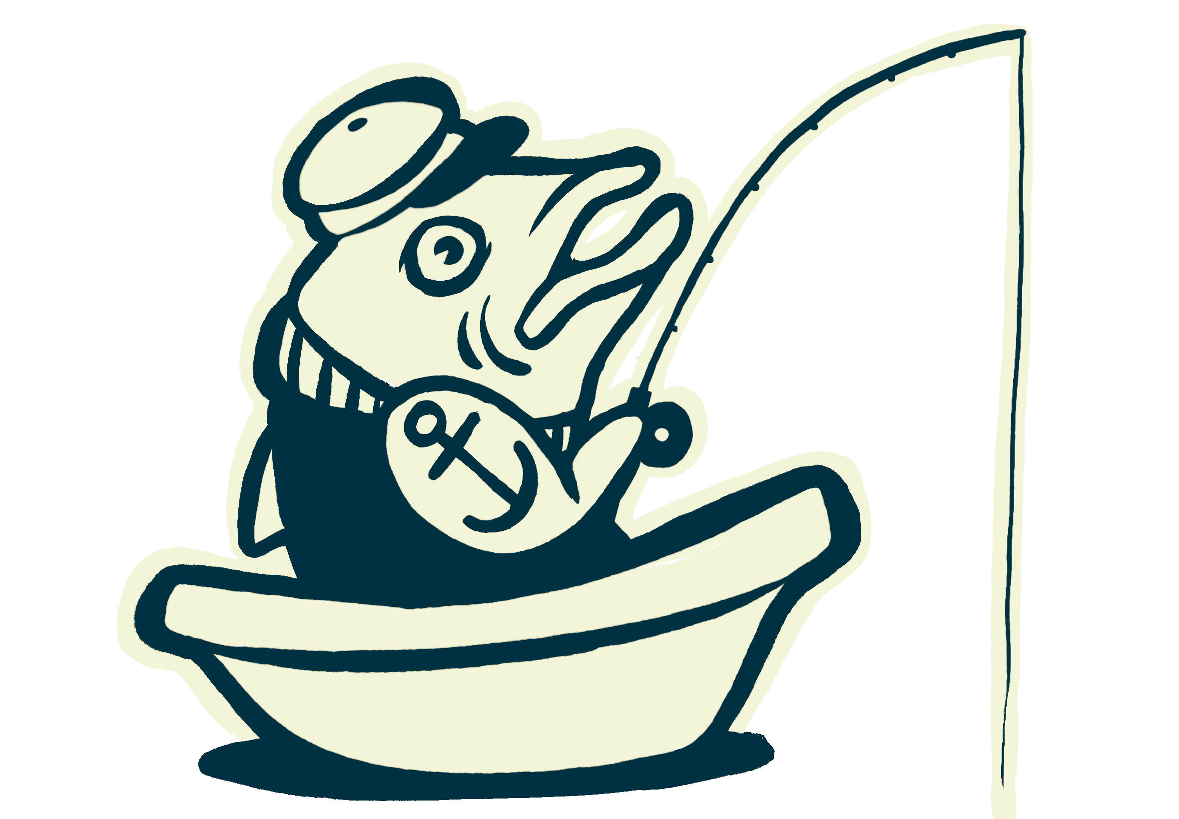
Secondary — the mascot lands anywhere calling for an extra dose of personality.
-
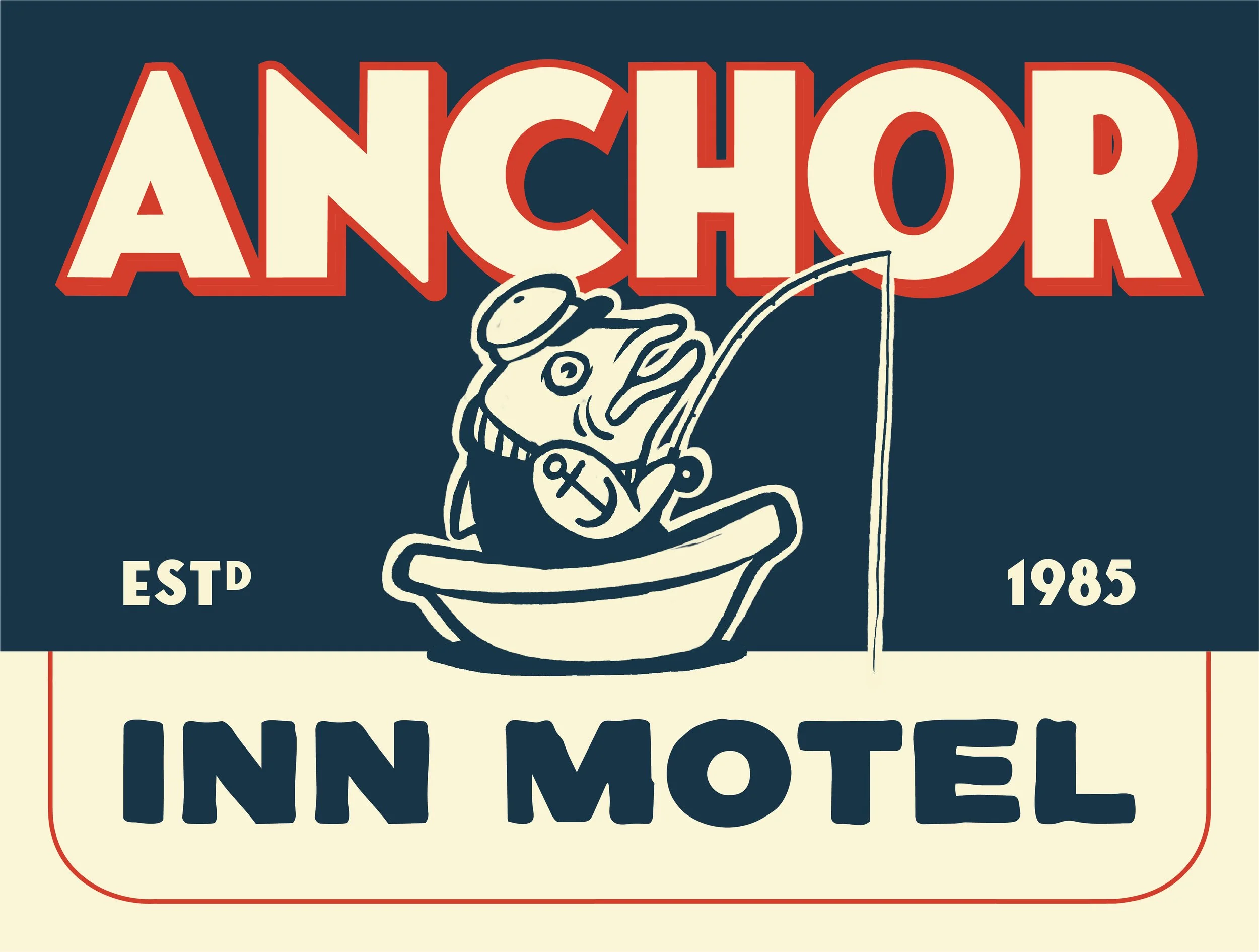
Navy and cream do the labor, whilst red is the flag. The mascot deploys wherever humor is needed, and never explains itself. ESTD 1985 always flanks the name, acting as the credential.
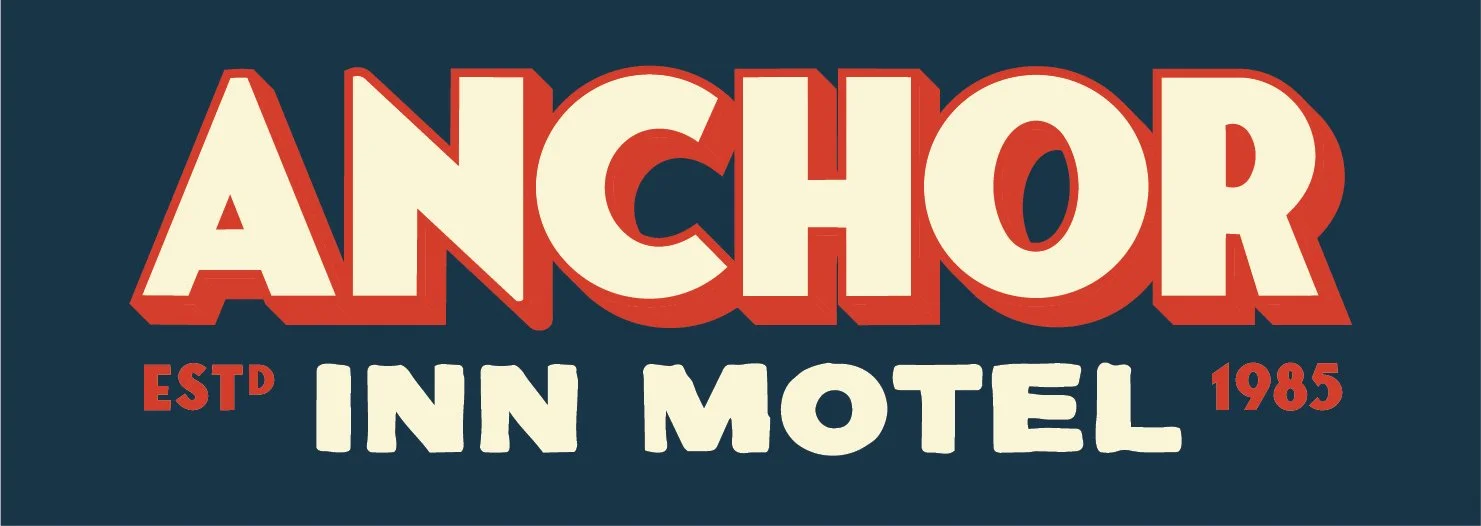
Primary — signage, amenities, labels; broadly applicable across a range of sizes.
-
The identity borrows from the era when a motel was a vacation rather than a compromise, channeling a deliberate nostalgia via the chunky sign-painter letterforms, a red drop shadow, and ESTD 1985. The mascot came from two unlikely references: tinned fish packaging and the 1920s cartoon, Popeye. Both carry the same quality: something unpretentious that takes obvious pleasure in what it is. That felt right for a motel that doesn't take itself too seriously but absolutely delivers.
the palette
The palette is pulled from the project's predecessors. Navy and cream evoke the classic sailor uniform. Paired with the red, it completes a sign painter's palette.
Deep Sea
#00303f
Sweet Cream
#f4f4dc
Firetruck Red
#d54127
the detours
-
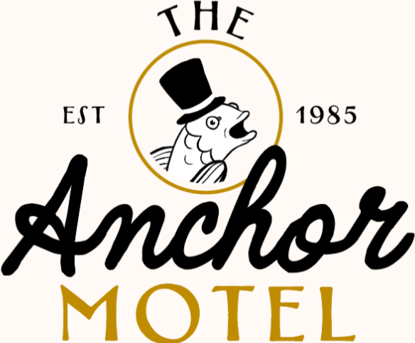
Corny and fancy at the same time, this take nailed two wrong registers at once.
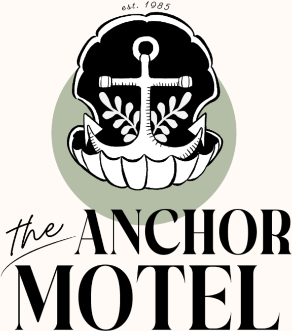
Both dead ends made the same mistake by dressing the motel up as something it isn't.
-
This take promised a luxury spa, rather than a motel.
the payoff
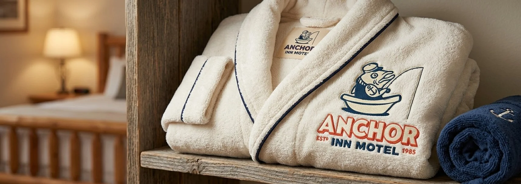
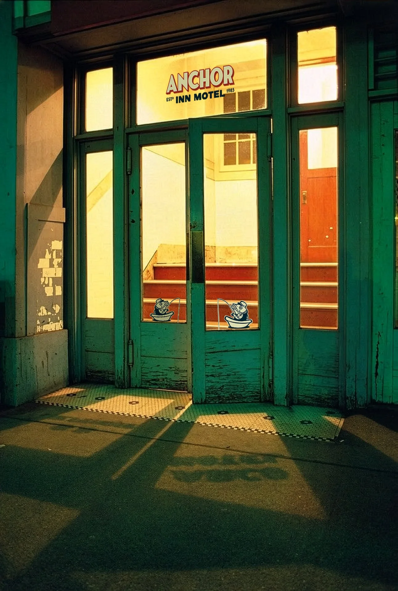
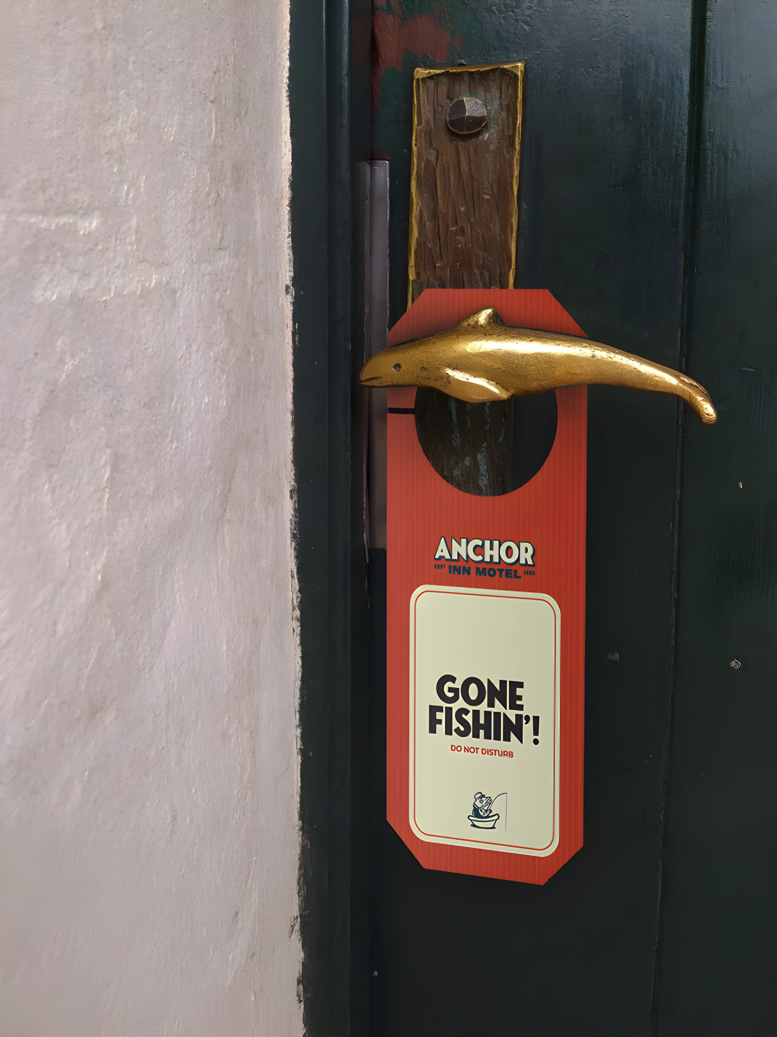
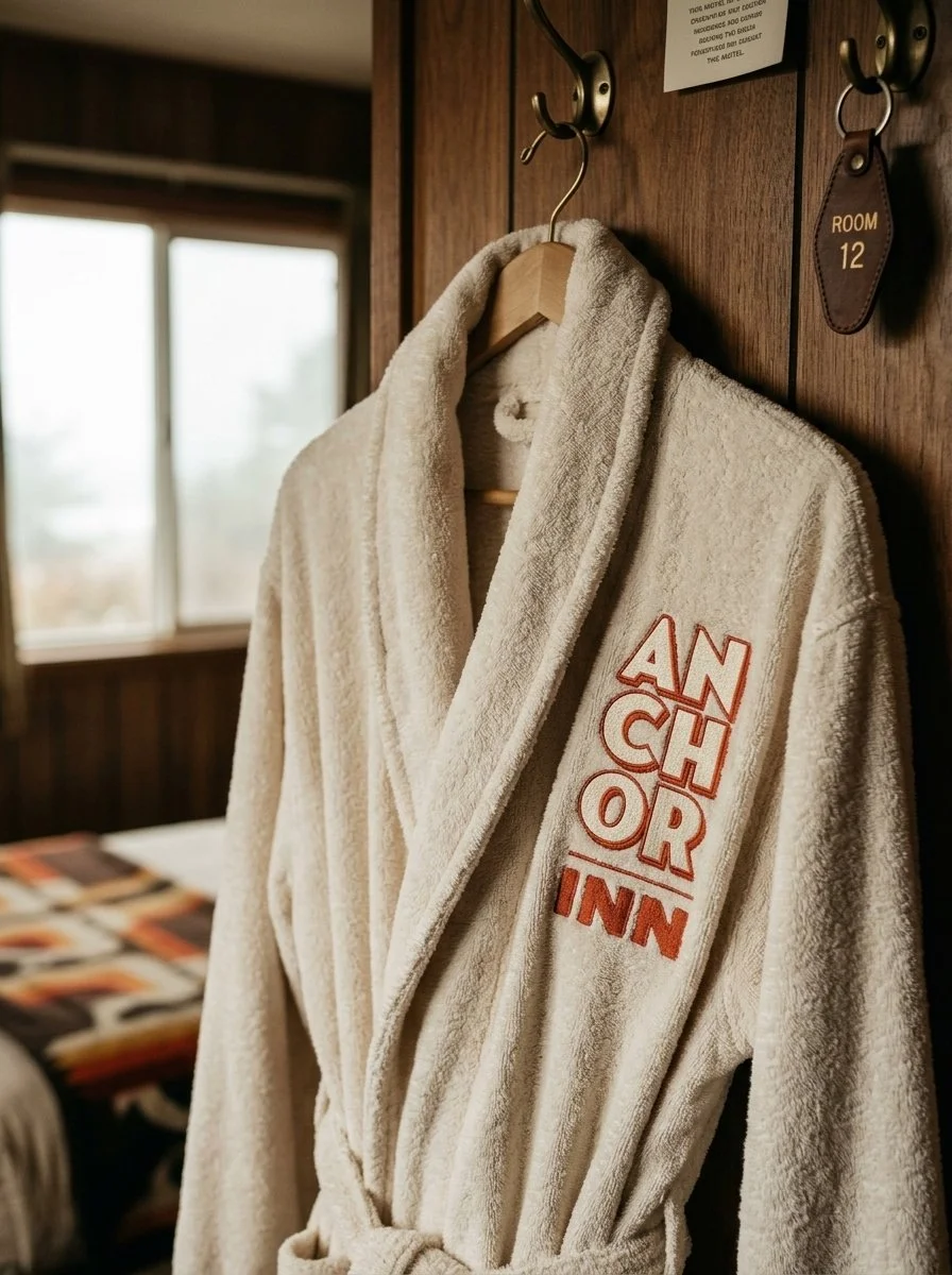
The moment it was done was on the mockups. Rendered on the sign, the door hanger, the soap, the towels, and suddenly it was somewhere I'd love to stay. The killed rounds never managed that. The spa version was nice, the top-hat version was funny, but neither was a spot I'd bother pulling over for. A rebrand built to stop passersby is finished when it stops the designer.