
Fire & Story
Winter Festival
Growth through community.
the setup
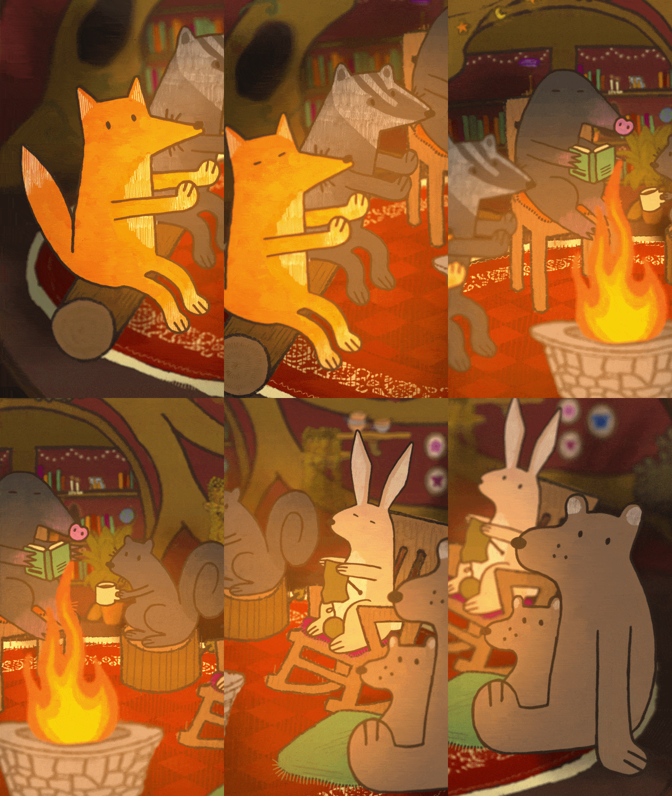
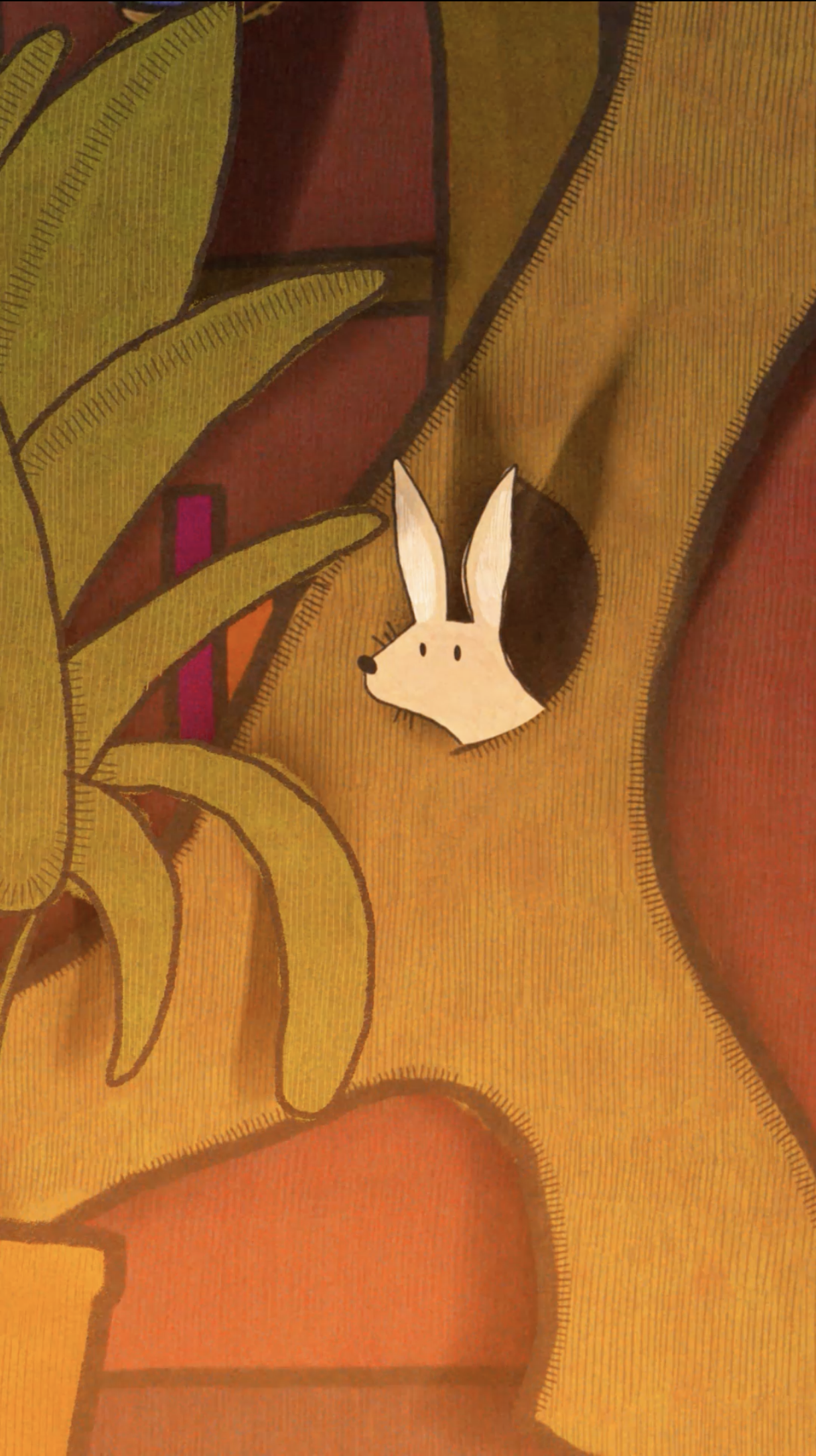
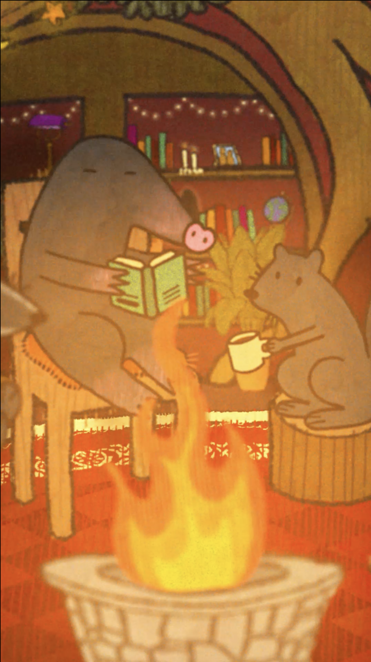
Fire and Story is Bellingham's storytelling festival, and every year Western's design students team up to make a collection of motion pieces that are projected nightly on the festival's water tank. This year's prompt: growth. Sixty seconds, no dialogue. The camera drops into a burrow on a cold winter night. One by one, the animals arrive, and with every arrival, the fire grows. Nothing is explained, rather the warmth is the story.
Brief
Annual collaboration between WWU's design program and the Fire and Story festival (Paper Whale, Bellingham).
Team
Burrow setting & lighting: Robyn Ilaria
Animals & storyboard: Phoebe Setter
Forest setting: Ayla Metz
Story & motion: shared
My Deliverables
Interior setting illustration, lighting design, motion.
the palette
The visual language comes from vintage Christmas cards and old children's books. Flat cutout characters and stitched outlines with fabric grain woven into every surface. It puts the audience somewhere they've already been: a story read aloud before bed. The illustration was a collaborative effort, with Phoebe Setter creating the animals, Ayla Metz the forest, and me, the burrow. The shared texture is what makes the joints invisible.
The palette is inspired directly by the space, with cream from the tiles, black from the grout, and a sharp ultramarine that cuts through both. The blue does double duty, a nod to commercial cleaning without letting the identity tip too far into grungy or clinical. It keeps you guessing, and that felt appropriate.
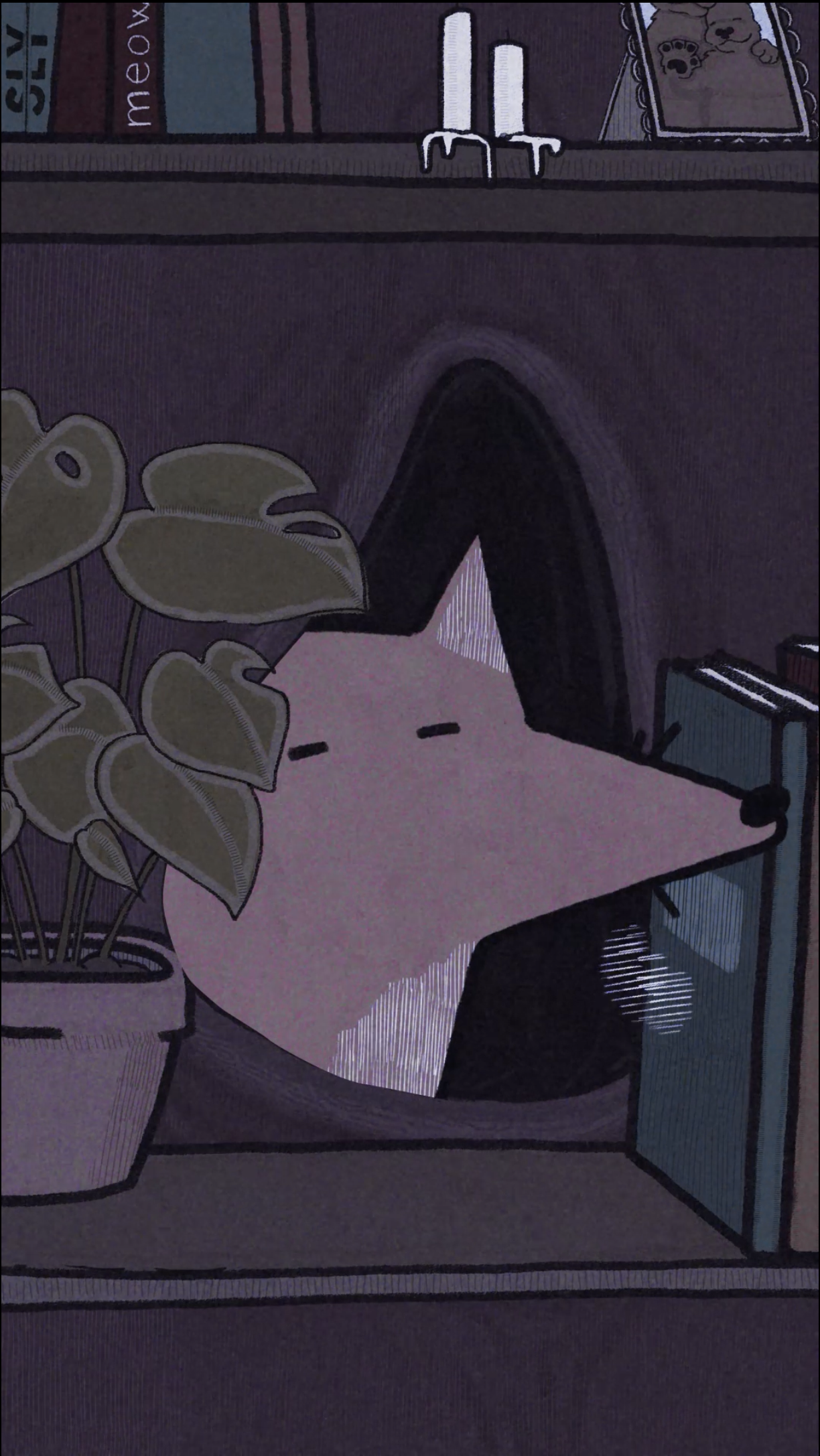
The lighting is the plot. The piece opens in winter blue and ends in firelight, the room warming up with each arrival. Cold is the absence of company. The palette only warms when somebody shows up.
in the wild

Merch can also function as a casual uniform for staff.

Merch provides minimal context, so that every little moment piques curiosity.
the detours

-
Right direction in the wrong costume. The decorative deco and
Right letterforms in the wrong costume. Deco script, a winking dot on the i. Cutting the trim left the halved T's to do the winking.
The most dragged out detour was a retro-futurist mood board I loved too much, characterized by red and black and hard geometry. I spent weeks trying to perfect it, but it kept photographing like a warning label.

-
All intrigue with no invitation. This take guarded the door rather than opening it.
the payoff
The deliverables list said logo and visual identity.
The rabbit hole unearthed a naming system, a censor bar ad campaign, and a cocktail menu where every drink is in on the joke. By the end, someone else could write the next Lint Trap component without me in the room.