
KOHA Cat Food
Packaging Design
Sold to the cat.
the setup
Pet food packaging all looks the same, and nowhere more than the special diet shelf, where KOHA lives. Every can is clinical and quietly apologetic, serving as a constant reminder that something is wrong with your cat. This redesign introduces a different take entirely, one where the cat is the customer. Of course, the human still does the buying. It's just that now it's the most fun decision in the aisle, made for the animal having the most fun on the shelf.
Brief
Packaging redesign for a real pet food brand. Student brief, unsolicited.
Deliverables
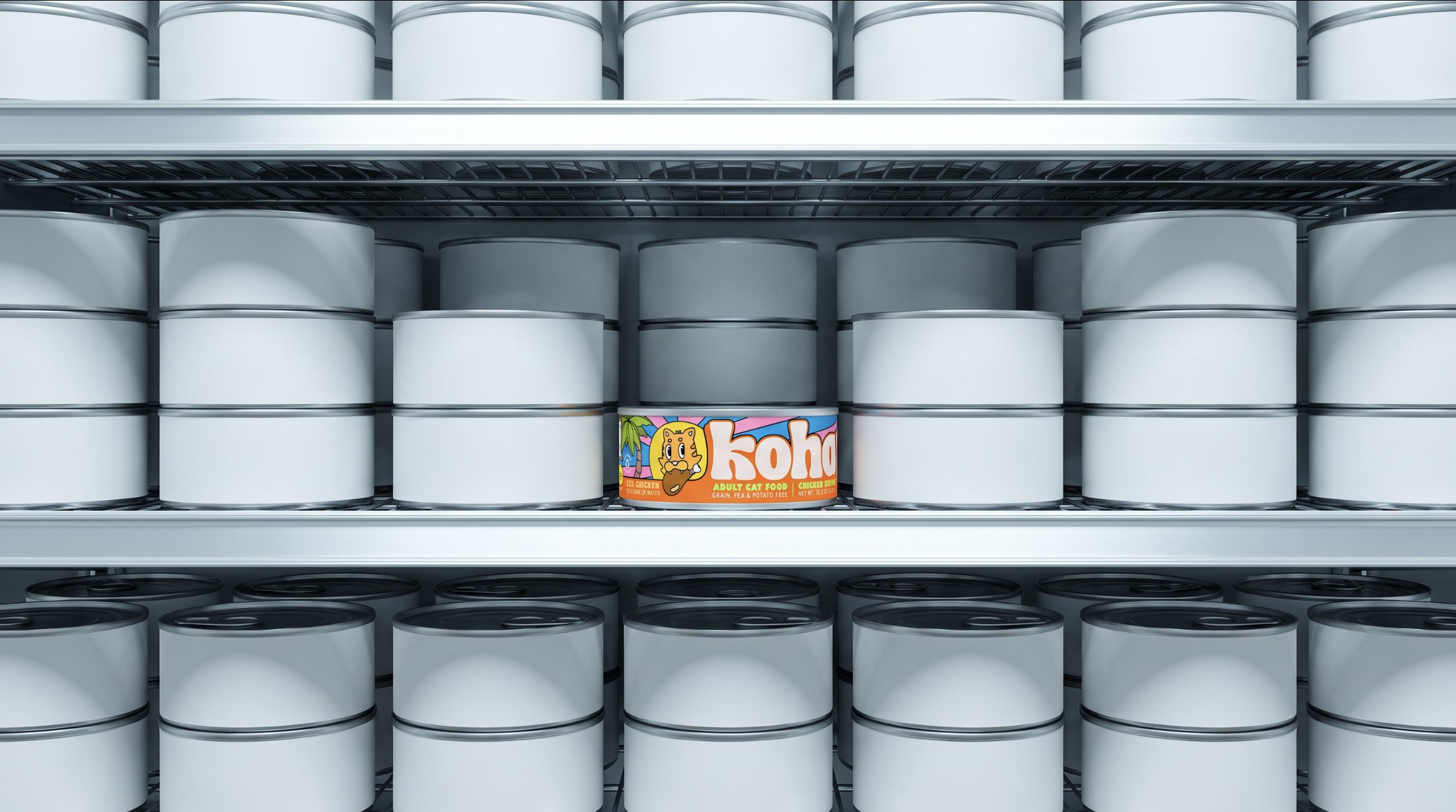
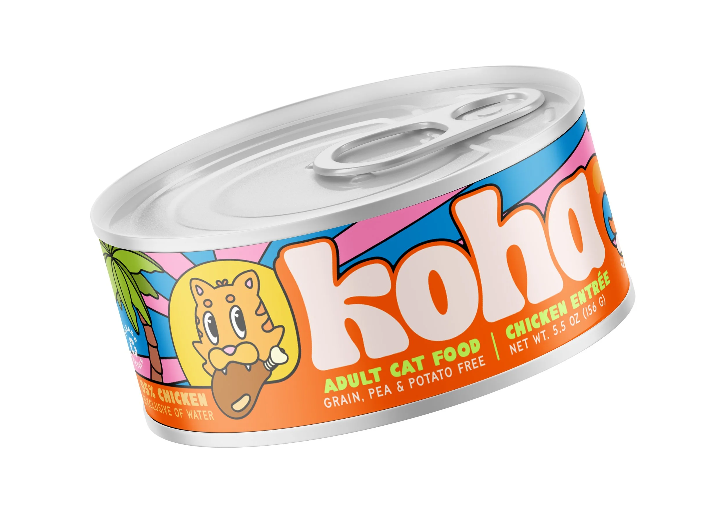
Label system: three flavor colorways, mascot system, full regulatory layout, can mockups.
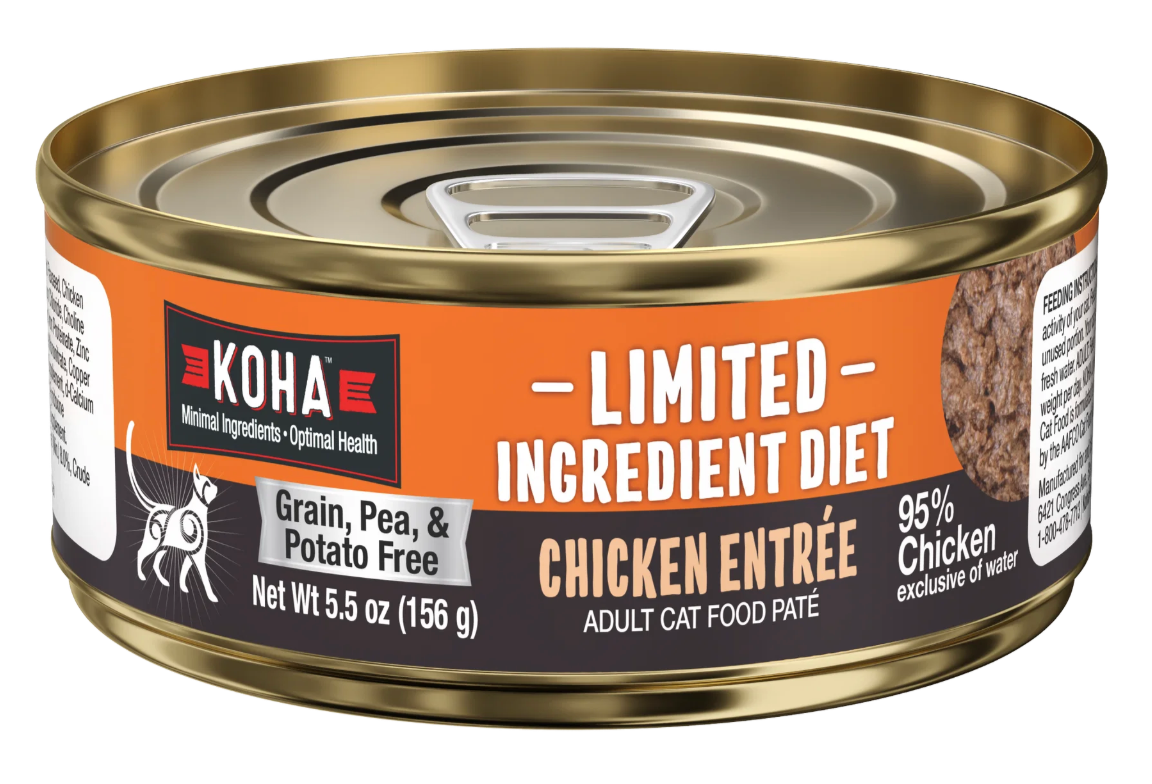
The original packaging hints at vaguely tropical without committing to anything clear enough to read as such.
the past
the future
MOTION GOES HERE
the palette
Sunshine
#fad107
Tangerine
#ff6700
Flamingo
#ff8fc3
Marine
#6c2aff
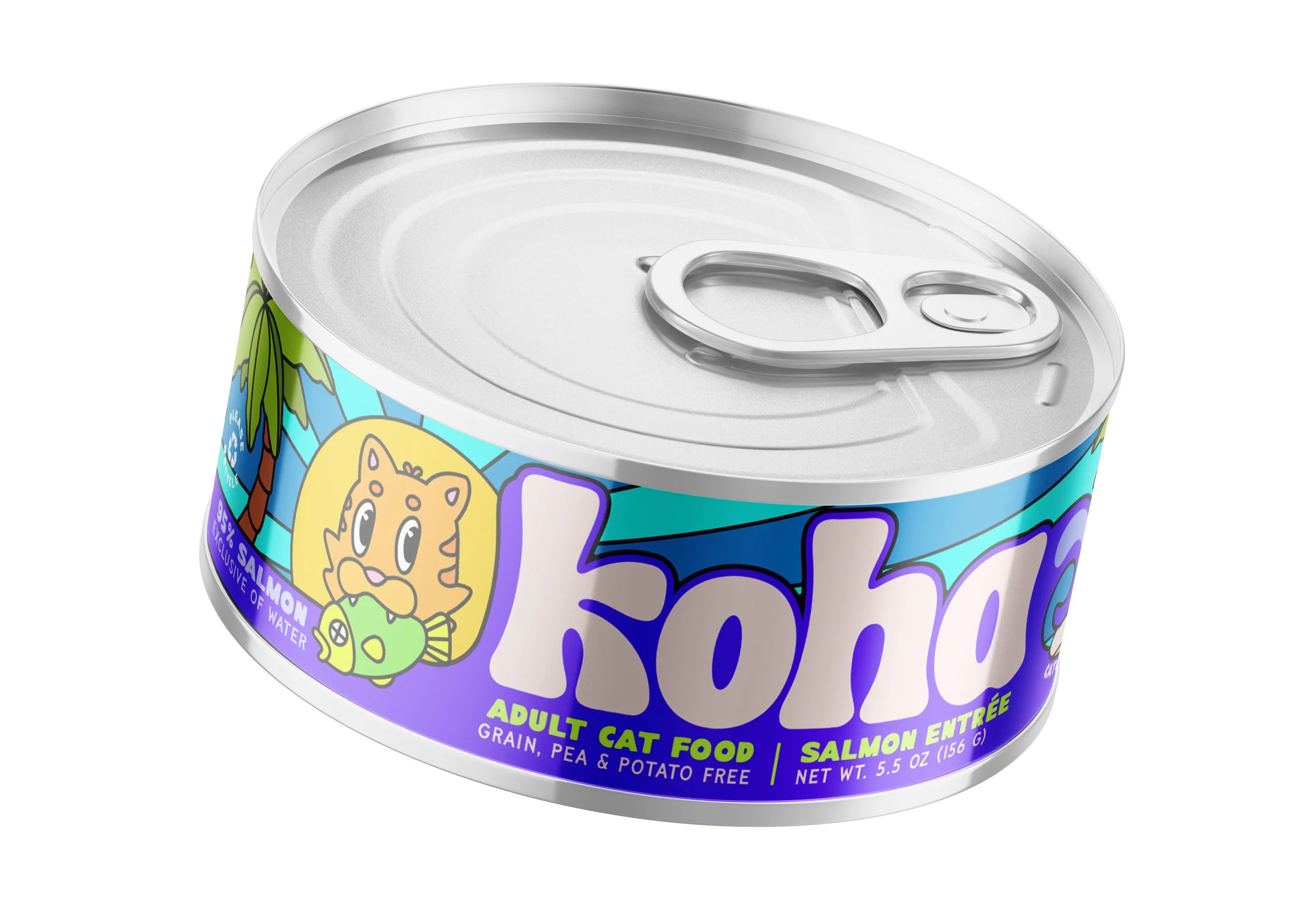
Sunshine
#fad107
Pool Party
#07faf6
Sunshine
#fad107
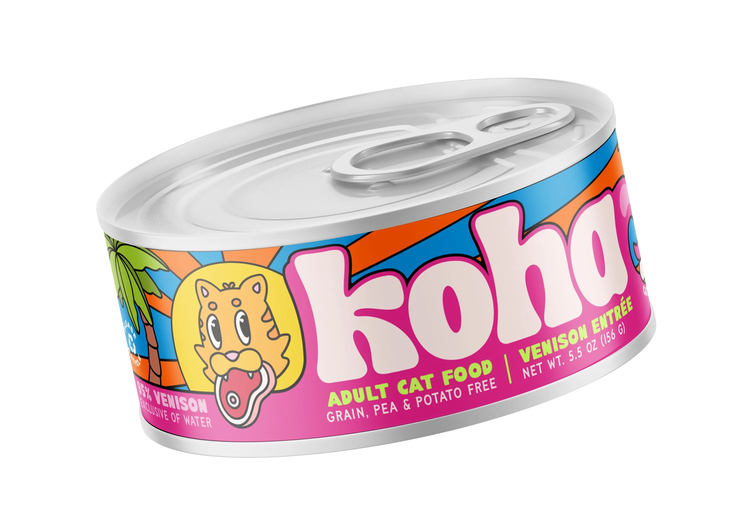
Beach Ball
#e73a95
Tangerine
#ff6700
the details



the payoff
The starting point was a tropical hint the original never committed to. The process was the commitment, every element and color earning its place by adding to the party, the whole way down. The proof came off the printer: holding the test run, it was simply fun, the way nothing else on that shelf is.