The Lint Trap
Brand Identity
We like it dirty.
Project Overview
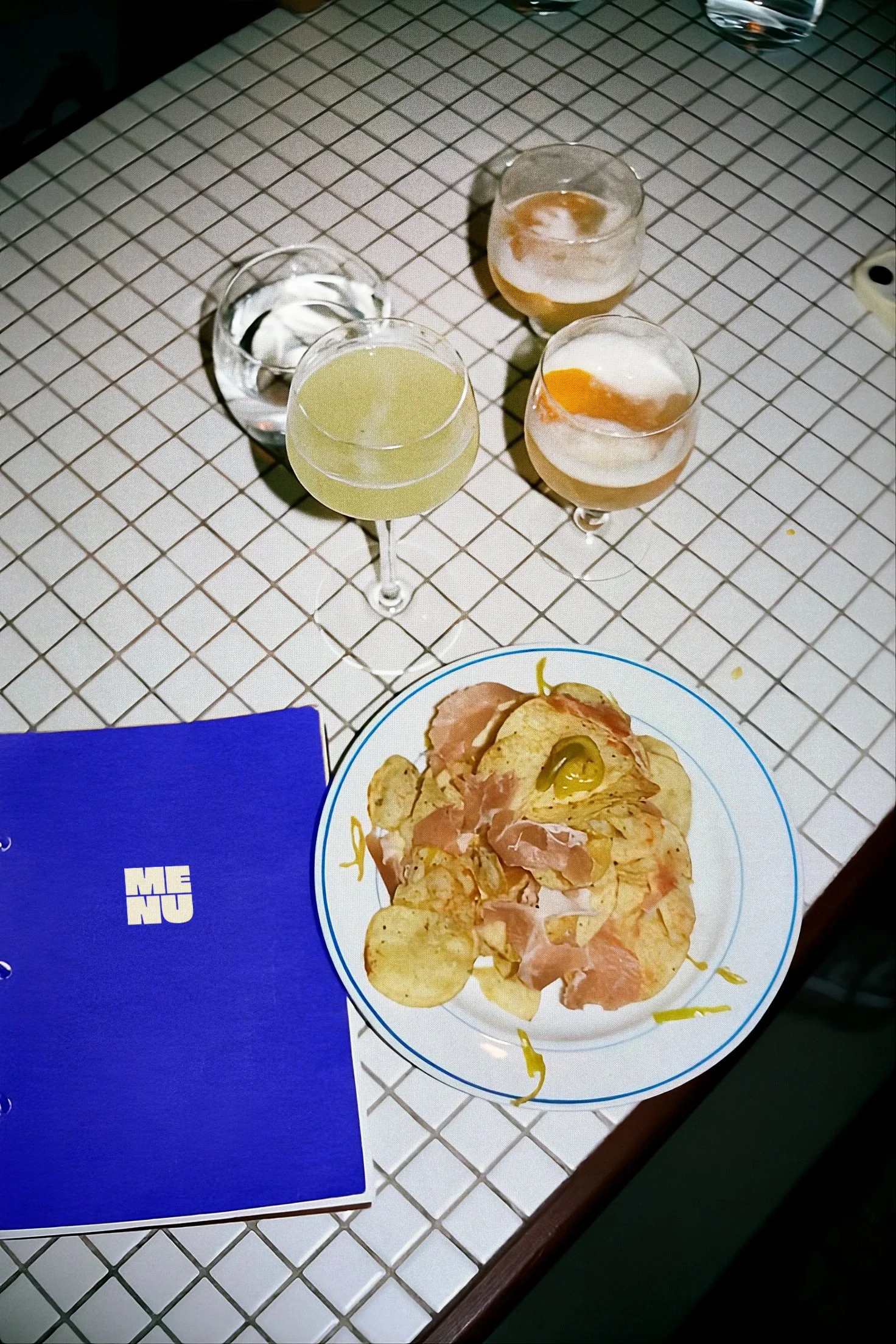
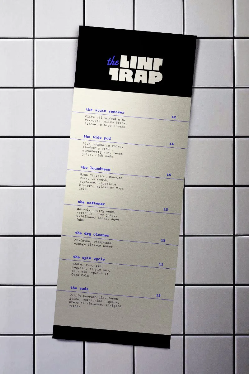
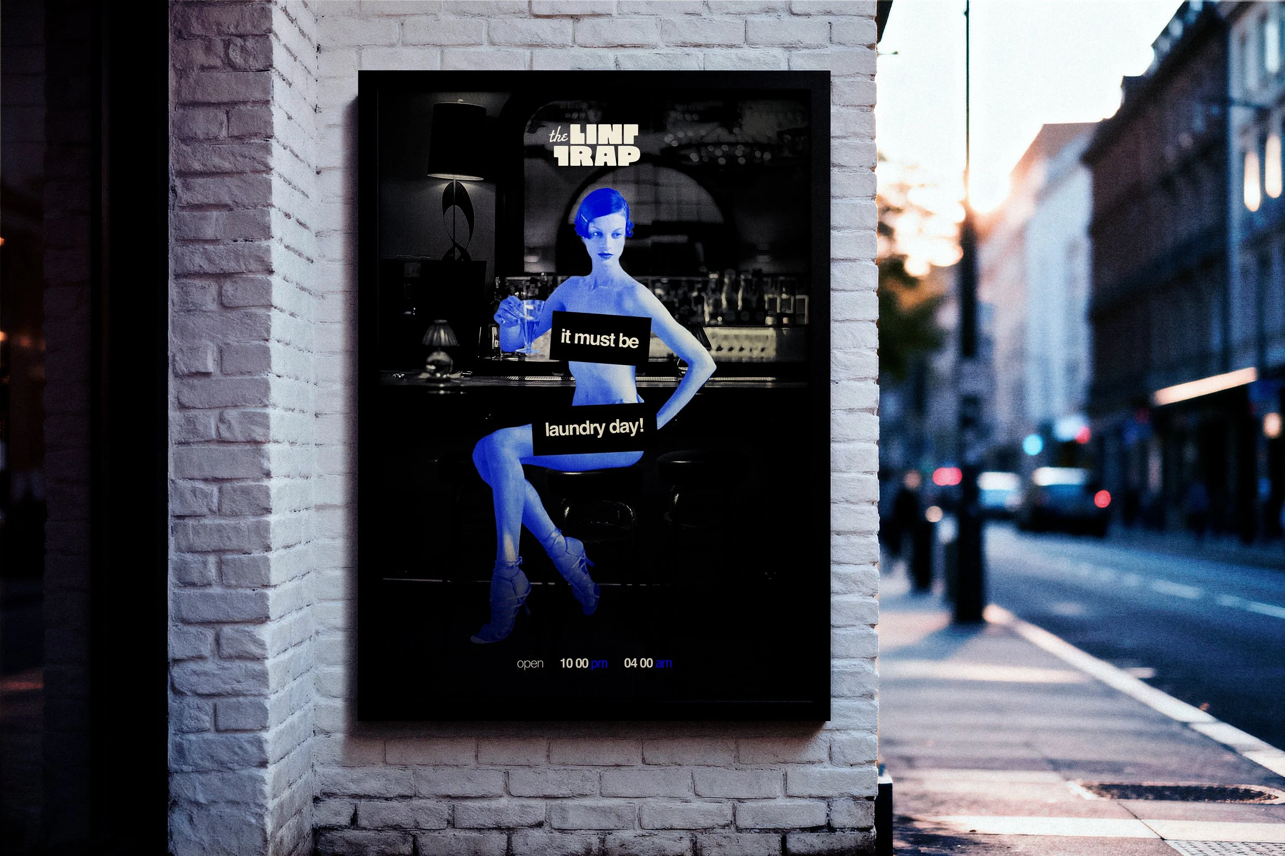
The Lint Trap is a laundromat with a secret. The brief was simple: brand a fictional speakeasy hidden inside one. The challenge was finding an identity that could hold both the indie grit of a neighborhood laundromat and the quiet intrigue of something illicit behind the machines.
Client
The Lint Trap Speakeasy
Services
Logo Design
Visual Identity
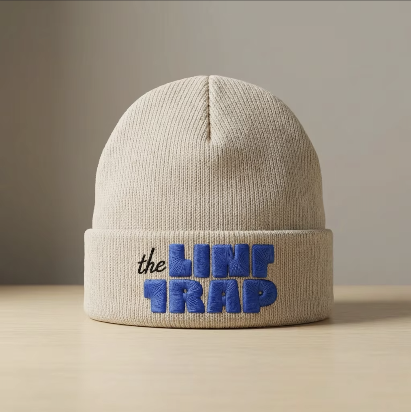
Lock-up 1
Lock-up 2

Logo System
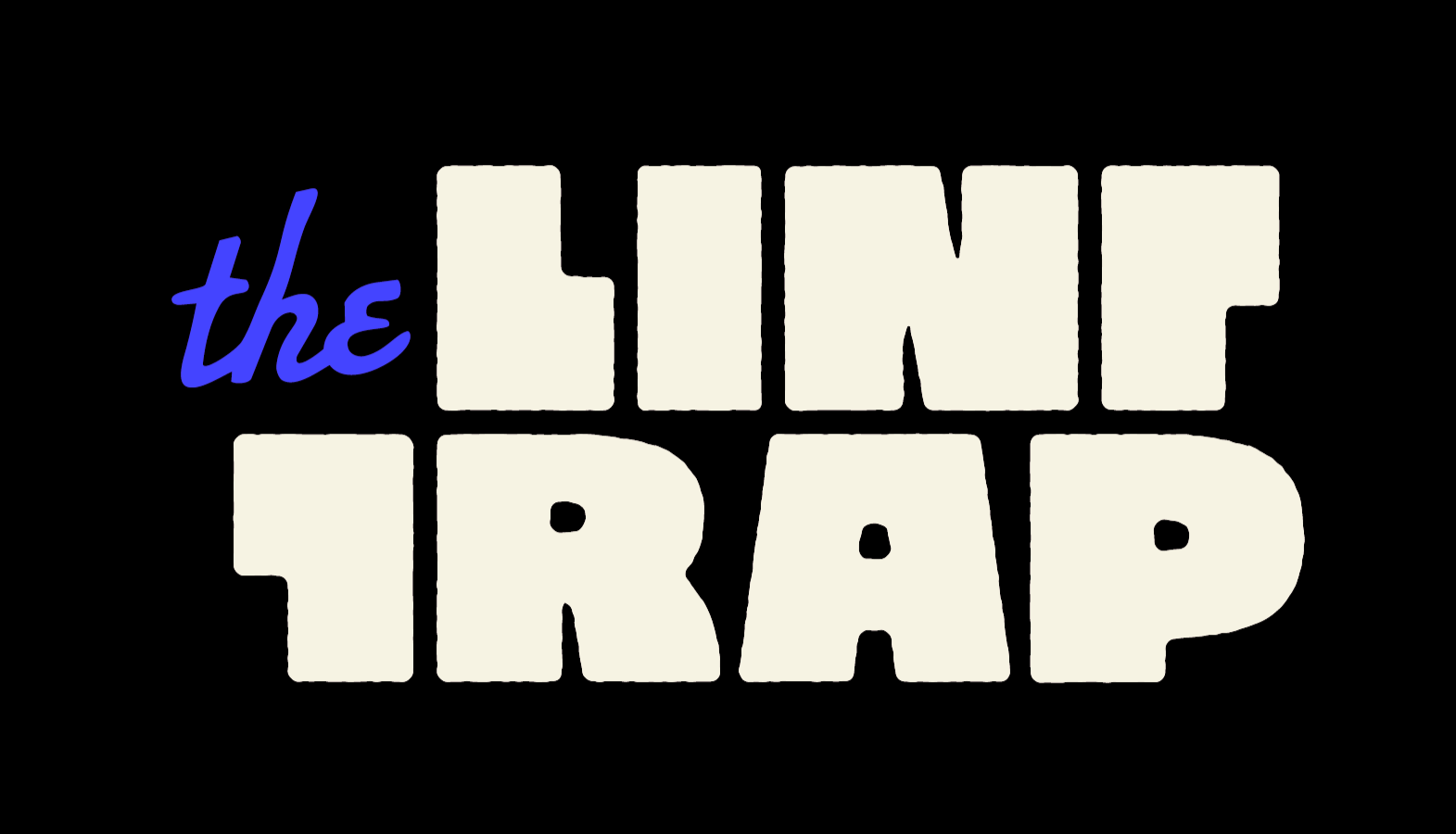
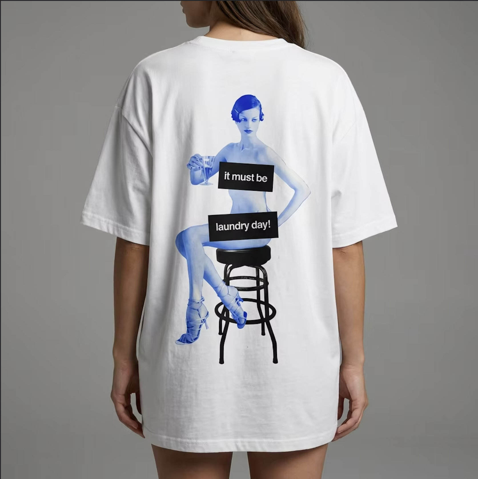
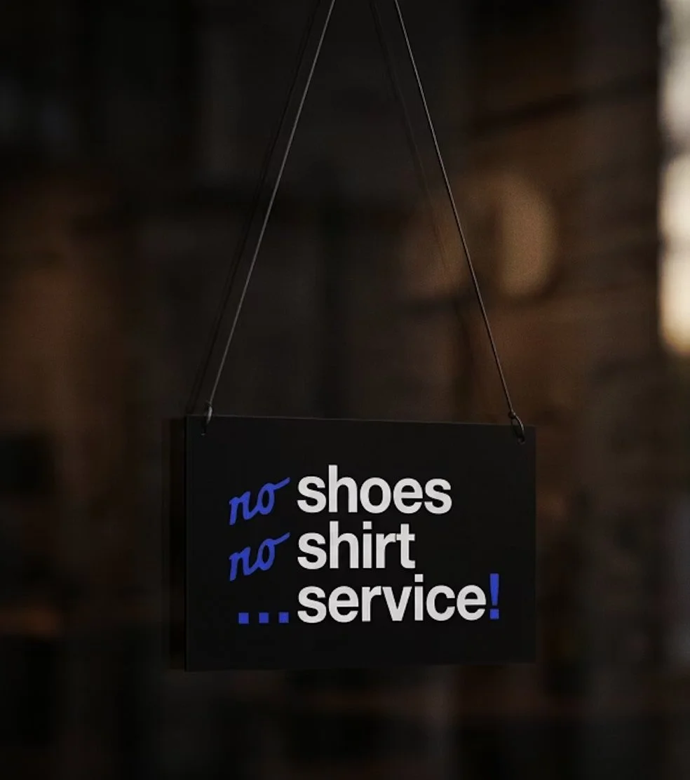
The palette comes directly from the space: cream from the tiles, black from the grime, and a sharp ultramarine that cuts through both. The blue does double duty, a nod to commercial cleaning without letting the identity tip too far into either grungy or clinical. It keeps you guessing, which felt appropriate.
Ultramarine
#4444ff
Obsidian
#000000

Eggshell
#f6f3e5
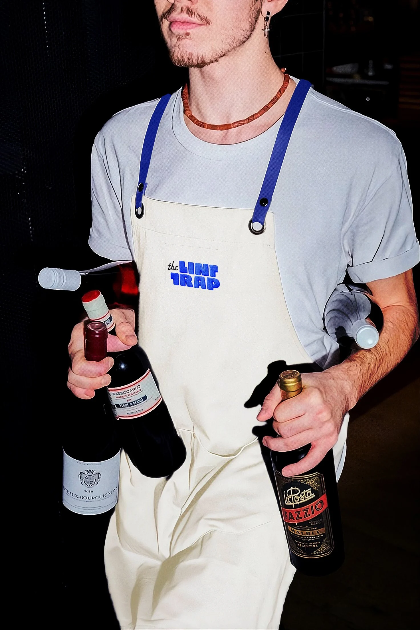
Merch